
Just as America has its Stars and Stripes, we should fly the Black and Silver.
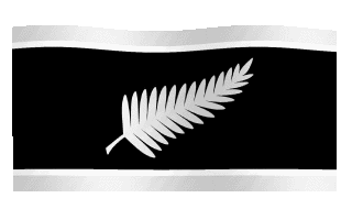
This was the first of my black designs. I went off it for a while, but now that I can see it “flying” (if it’s not moving, click the flag), I do think those first instincts were correct.
I’ve adjusted it slightly by making the white fern silver, which to me is one step more stylish – not to mention truer to nature.
And the white and silver bars provide relief for the black, which looks too gloomy by itself.
My fern designer Kenneth Wang has suggested a darker silver for the bars, which does make them easier to see.
This is the flag I’d like to see us fly over the Auckland Harbour Bridge on Waitangi Day, and be adopted as the new New Zealand flag.
Now here it is in a range of ‘locations’, so you can see how it could do double duty as a national logo.


What do you think? Does the moving flag change your mind about this design?
Can you help Kenneth Wang and me raise the $20,000 we need to make a 1000 square metre (10,000 square foot) flag and get a helicopter to tow it around Auckland for an hour and a half?
If so, please email john@johnansell.co.nz by next Wednesday 20 January.

Hey John – why not start a “https://www.givealittle.co.nz” campaign – worked for the the Atheist Bus crowd.
Thanks – will look into it.
Still looks like a white feather to me John.
Our current flag will do just fine thanks very much.
I know you’re a traditionalist, big bruv, and we’ll just have to agree to disagree on this one. Out of interest, do you also think Canada should have kept their red ensign flag? http://www.crwflags.com/fotw/flags/ca-reden.html
What the Canadians should or should not have done is none of my business John.
I am not trying to avoid the question, merely pointing out that I do not know enough about the history behind the decision to change the Canadian flag to be able to comment.
My history and my family heritage is tied up in our current Flag, none of us would dare suggest that we toss away anything to do with Maori history or heritage so I fail to see what rights republicans have to do away with mine.
Unlike most Kiwis I have no problem at all if our flag is confused with the Aussie one, I do not suffer from an identity crisis nor am I insecure about where I come from.
I do not see any need at all to change our flag, even if we did the rest of the world would not care one little bit.
P.S…While the Canadian flag is indeed a nice one, the best flag in the world (IMHO) is the Scottish Saltire
Both the Scottish and Canadian flags feature a single strong symbol, which is what I’m driving at.
I, too, am a British-descended New Zealander. But I note that many of our fellow countrymen are neither British nor Maori in origin – just as many Canadians in 1965 were neither British nor French.
So they chose a non-racial, non-imperial symbol, and I think we should too.
The other parallel with Canada is that their change of flag did not lead to them becoming a republic. It needn’t do so here either.
Brilliant design John & Ken, now you just have to convince John the Jew. You get my vote.
I’m sorry you chose that expression as I’m trying to keep racial and imperial issues out of this discussion, Kevin.
But thanks.
I spoke to John Key about the flag in 2007 and he thought it could make a good second-term issue.
In Canada it took a PM who was prepared to take the lead over the complaints of war vets, beaver fans, etc.
Now Canadians can thank him for giving them the world’s best flag.
Your comment “John the Jew” was quite uncalled for, Kevin Campbell. That sort of rubbish is common in old world Europe, but not welcome here in this country.
I like your fresh flag design and symbolism, John A and Ken. What I don’t want is a rush to republicanism without a lengthy period of debate and reflexion (at least 10 years) on what constitutional arrangements and documents we need to put in place, including bring Treaty grievance processes to an ultimate conclusion. No more ideological Supreme Court or EFA initiatives, please, without a clear political mandate and a serious effort at national consensus.
Thanks Basil. A new flag doesn’t have to be linked to a republic. Canada still has Queen Elizabeth as head of state 45 years after they changed their flag.
Basil, relax, its a fact he’s a Jew. If it was Helen Clark I would have said Helen the dirty filthy communist.
I’m against changing the flag, but I’d tolerate this one if it didn’t have the bars. I’m a minimalist and I also think the Canadian one would be better without its red bars.
Think Japan and Switzerland. Just symbols. Think France and 90% of the rest of Europe. Just bars. Bars and symbols don’t mix.
I’m a big fan of simplicity, Camryn. I liked the All Blacks jersey when it was just plain black with a white fern (and a much more beautiful fern than they’ve got now).
But to me, an all-black flag would be too heavy. It seemed to need some relief from the black in the same way as Canada’s needed some relief from the all-white.
I tried the red maple leaf on all white and thought it looked too bare.
Perhaps a combination American/Israeli flag would satisfy ‘Jewish John’ and those who hang off his every mangled word. Your silver fern might fit in the bottom right corner Mr Adsell.
Btw, how is your brand-spanking new political party shaping up? It sounded so fresh when you first floated the idea.
Let’s drop these anti-Semitic references, it’s not a good look.
As to the party brand, I’ll be blogging some ideas on that soon. Since I first mentioned it, Lord Monckton has been talking about something similar, which is encouraging.
New political party? What? What? Tell me more. Can I be leader?
Not a party – an idea for a political brand.
Lord Monkton? Lord Monkton !!!
That’s sunk it.
I’d expect you to say that, since his idea of a world alliance of Freedom Parties is intended as a much-needed buffer against the very powerful international Red-Green movement.
It’s easy to mock Monckton as a potty peer and so on. Not so easy to explain why everyone on the left runs a mile when challenged to debate him.
Kevin, you couldn’t lead a parched dog to water. Piss off back to your neck of the woods called Red – get it?
Red neck.
I haven’t usually been keen on the silver fern on a black background – 80% black is just too much black on a national flag (or any non-pirate non-anarchist flag).
But you’ve convinced me with this one – specifically with the silver bars. Still simple, still striking, and much better than any other current fern designs. I’d fly it.
Good to hear, stan/winston.
Basil, relax, its a fact he’s a Jew. If it was Helen Clark I would have said Helen the dirty filthy communist.
And if it was Kevin Campbell I would have said Kevin the racist, bigoted anti semite.
A fair riposte to an unfortunate comment, Radman. Now I’d be grateful if we could draw a line under this subject and get back to flags.
Great design guys. Its long overdue and the silver fern is the perfect symbol for NZ. NZ First used it well as part of their branding.
I would certainly get in behind this campaign, and as a monachy supporter myself do not think that this would be at all offensive.
Thanks Gary, appreciate it.
I have no strong feeling about who our head of state should be. While I’ve long thought the Royal family a quaint irrelevance, I can’t get excited about a Sylvia Cartwright/Anand Satyanand-style president either (no disrespect to these fine people).
Personally I like the Hundertwasser Koru flag way more. Yes it was designed by a foreign born Austrian. But he loved NZ enough to come and live here and die here. And he was a world class artist.
http://flagspot.net/flags/nz!.html
I know it’s traditional, but I don’t like a flag that is all black, it looks like a pirate flag to me.
I am really in favour of changing the flag, but am terrified it will be changed to something horrible. I guess this is one of the biggest obstacles to change.
A common criticism of silver fern variants of the flag is that it has too much black. People seem to find it pirate-like or too dark. I personally don’t but since the flag is more about what the whole world makes of it, I can see the problem.
That’s why, although I personally could tolerate the silver fern flag, I think a proposal that’s more likely to fly would not be black based.
Furthermore, if it’s not black based it shouldn’t have black on it at all. I don’t like it with bars (as I said above) for aesthetic reasons but also because the bars mean nothing. I especially don’t like black when mixed with blue. I’ve seen a ton of designs that try to mix the current blue with Maori motifs that include black and it does not work.
I feel before we go further down the “Let’s Get A New Flag” path, we need to put an end to the “Let’s Fly The Maori Protest Flag Over The Harbour Bridge and Govt.Buildings” PC waffle. All that does is fuel division and lift our latent racism to the surface…on BOTH sides of the great divide.
Once we all unite (or at least stand together) under the New Zealand flag that we all know, then perhaps we can gently begin a lengthy process of change consideration. But any suggestion of an exclusively Maori design must be hit on the head. Reason? Maori comprise only 10% of NZ’s population. There should be no favouritism in that direction. Heck, otherwise a large demographic in Auckland will be demanding the inclusion of some Asian perspective.
We’ll end up with a patchwork quilt showing a little of something for each and every ethnicity here!
I agree that we need a simple clear design…but I believe we have that already.
From Kiwiblog
“Despite being unfairly branded a racist for my Iwi/Kiwi billboard”
Classic!
Says Greenfly who supports a party that not one single electorate would ever want to be represented by one of his MPs. Stick to the topic Greenfly.
Keep up the debate John, I am not too fussed either way – especially if the Aussies change their flag before us.
Thanks Clint. But why wait for the Aussies when we have a more obvious national symbol than they do?
Their only real contender is some configuration of the Southern Cross and the colours green, white and gold.
Poor choice of words on my part JK, no offence to your Jewish faith intended. A momentary lapse of judgment.
Thank you Kevin – though I don’t think John Key practises the Jewish faith.
Heraldry has certain ‘rules’ about what colours should be contrasted with other colours. Gold/yellow and silver/white are ‘metals’. Red, Green, Blue, Black and Purple are ‘colours’. The rule is you shouldn’t put a colour on a colour or a metal on a metal. The reason for this, is that in order to aid identification you want to have good contrast between the background and the foreground.
If you look at the non-tinpot-country flags from around the world, you will see that they pretty much all follow this rule.
Even on our current flag, the red stars are fimbriated, or surrounded by a white border, in order to provide contrast with the blue background.
This also backs up the earlier posters comment of not liking blue on black, this would also have poor contrast.
In your proposed flag, you have silver and white together, this is really too subtle a difference to be distinctive and I feel it is more suitable to an artistic logo than to a flag.
Thanks PeterG. Point taken. I was aware of the rules, but thought I’d break them just this once!
The feedback suggests I’d have been wiser to promote one of my four more popular fern designs (according to the flag poll).
I just thought this one looked better when flying than it does flat.
Good to have the debate though.
Great to see the fern. I am not sure about the silver bars, as it makes it more of a logo than a flag.
We need to find a good and strong champion to get it going to make this dream a reality. I surely do not advocate for wide and time consuming consultation, debates, reflexion, etc. Who is in charge, the majority of people, should decide. We all know that we need to change that flag (which was temporarily established by the New Zealand Company anyway), but some people are just afraid of change.
Keep pushing, let me know if I can help in any way.
The fern is better, that white feather may not be known in NZ but it sure is known elsewhere in the world. Look it up and what it means.Far too contraversial and would make NZers look ignorant. Viv
If someone confuses a white feather with a silver fern, which looks nothing like it, then it shows ignorance on the part of that person alone. The silver fern is so obviously a fern it would be difficult to innocently confuse it with a white fluffy feather – when was the last time someone assumed the All Blacks uniform had a white feather on it?
I think it looks depressing as do all blacl silver fern flags and the the resemblance to a white feather cannot be ignored (the Aussies would have a feild day). The Kyle Lockwood red, white & blue silver fern flag is the only SF flag I would fly.
I do like the idea of black and silver with the fern but I thought about the National Athem *guard Pacific’s triple star* Perhaps add 3 stars to represent the Islands Nth Sth and Stewart or put back on the Southern cross like one of your other flags. Anyway love the ideas. whatever the flag is I do hope it represents all of New Zealand.
“Perhaps a combination American/Israeli flag would satisfy ‘Jewish John’ and those who hang off his every mangled word.”
Hahaha! Had to chuckle at that one as I agree with the sentiment behind it. Anti-semitic? No, he wasn’t saying anything about the myriad of other semitic tribes – just the jews, so therefore not actually “anti-semitic” (a GROSSLY overused & incorrect convenient “shut-it-down” term much like “fascist” or “racist”).
On the subject of flags, ACTUALLY flags have ALWAYS represented somewhat of the history of a nation and have done for hundreds, if not thousands, of years. If you don’t “believe” so you’re probably a marxist, at the very least an easily led social one who just thinks they’re being “pregressive” (yawn) :p
EDIT: (Before someone jumps on it!) Yes, that last word in inverted commas was a typo. However, I do rather like the fit of that new word I just made up. It could mean something in between regressive & progressive hence hesitant, inactive, ineffective, un/misinformed or possibly ignorant, weak & altogether quite pathetic. Yep, that fits very nicely 😉
How the new flag and TPPA moves us closer to losing the Bill of Rights- no more trial by jury- just straight off to Gitmo for your thought crimes online. Hitler would be proud of John Key- and oddly enough, both of them were quite confused about who their fathers really were. History repeats.
http://www.postmanproductions.org/?p=2785