climate change, Guardian, IPCC, Rajendra Pachauri

Guardian reports IPCC admission it exaggerated glacier melt

Just kidding with the banner
– but is the media bias melting?

You know the end is nigh for any dishonest movement when its leading liars are forced to resort to truth-telling.

It was the same in the dying days of Soviet communism when Gorbachev confessed that his country had been living a lie.

The surprise with this story about exaggerated Himalayan glacier melting is not that the UN’s International Panel on Climate Change would present science fiction as fact.

That’s old news.

What’s new news is that Britain’s blinkered left-wing Guardian would do the honest thing and report it.

Is liars too strong a word to describe those who’ve deceived the world into believing they needed to divert $45 trillion to fix a non-problem?

Read this excerpt and see what you think: Continue reading

Chargoggagoggmanchaugaggogchaubunagunggamaugg, Language, Llanfairpwllgwyngyllgogerychwyrndrobwllllantysiliogogogoch, Poetry, Songs, Taumatawhakatangihangakoauauotamateahaumaitawhitiurehaeaturipukakapikimaungahoronukupokaiwhenuakitanatahu, Welsh

A song about Llanfair PG


My highlight of our trip to the UK in 2006 was a visit to the North Wales town with the longest place name in Britain. That’s me at  Llanfairpwllgwyngyllgogerychwyrndrobwllllantysiliogogogoch Station.

I’ve wanted to write a poem about it since penning one about Lake Chargoggagoggmanchauggagogchaubunagunggamaugg, the  longest place name in the US. That one took me four months. 

(Part III will be even harder: paying homage to the world champ  Taumatawhakatangihangakoauauotamateahaumaitawhitiure-haeaturipukakapikimaungahoronukupokaiwhenuakitanatahu out the back of Waipukurau.)

The Welsh poem turned musical when I realised that the name could be made to scan with a beautiful Welsh folk song we used to sing at Hutt Intermediate.

As follows… Continue reading

climate change, John Coleman, NCDC, NOAA

Is this the climate fraud tipping point?

US climate scientists’ idea of a mountain 

So much new stuff is flooding in on the climate fraud it’s hard to keep up.

If you’ve got a spare 15 minutes and want to blow your socks off, watch  Segment 4 of this special report by Weather Channel founder John Coleman.

It’s ClimateGate, American Style – evidence that the US climate  centres are up to the same tricks as the UK’s Hadley Centre.

In it, you’ll hear how both the National Climate Data Center and the National Oceanic and Atmospheric Administration have been removing  thermometers from thousands of cold areas to make the world seem warmer. 

You’ll learn that the temperatures reported for California’s snowy Sierra Nevadas were taken on a beach in San Diego.

Same for Bolivia – except the beach was in Peru.

So next time some journo tries to tell you that last year was the  fourth most stifling on record, ask them about all those missing mountain thermometers.

John Coleman, by the way, was the guy behind the petition of 31,000 sceptical scientists – 9029 of them with PhDs – which you almost certainly didn’t hear about in the mainstream media. Why not?

Because Al Gore had told them that ‘the science is settled’.

Thanks to Dan McCaffrey for sending this stunning report my way.

Architecture, Supreme Court

New Supreme Court not world’s ugliest

New Zealand Supreme Court

Scottish Parliament

Good news. Our new brass-clad Supreme Court building, being opened today by Prince William, is not the ugliest public building in the world.

That honour must surely go to the Scottish Parliament in Edinburgh. 

But I do find the judgment that went into approving the design of our new court a good argument for retaining the Privy Council.

(Yes, this at a time when I’m trying to change the flag.)

In the tradition of Te Papa and the Beehive, Wellington’s architects have once again blown a glorious opportunity to give New Zealand a world class building.

Instead, they’ve produced yet another modernistic eyesore – a poor man’s Bird’s Nest Stadium.

And you and I have stumped up $80 million for a five-person building that looks more like a razor-wire-fenced prison than a courthouse.

It does make you wonder at the quality of decisions that will emanate from this building. Can the best New Zealand minds really think better than the best from a nation of 56 million?

But back to that other provincial architectural embarrassment, the Scottish Parliament. 

I remember walking past it at the end of the otherwise stately Royal Mile and shaking my head in disbelief at this right royal hotchpotch of a building.

Bamboo window covers – how Scottish is that? They’d look more at home on a Maori pa than a Parliament.

In fact, they make our jagged brass pohutukawa seem almost relevant.

Defence, Humour

How nations deal with terrorist threats

A friend sent me this hilarious piece. The spelling of neighbor and defense suggest an American author, though it reminds me of John Cleese.

The English are feeling the pinch in relation to recent terrorist threats and have raised their security level from “Miffed” to “Peeved.”

Soon, though, security levels may be raised yet again to “Irritated” or even “A Bit Cross.” The English have not been “A Bit Cross” since the blitz in 1940 when tea supplies all but ran out.

Terrorists have been re-categorized from “Tiresome” to a “Bloody Nuisance.” The last time the English issued a “Bloody Nuisance” warning level was in 1588 when threatened by the Spanish Armada.

The Scots raised their threat level from “Pissed Off” to “Let’s get the Bastards”. They don’t have any other levels. (This is the reason they have been used on the front line of the British army for the last 300 years.)

The French government announced yesterday that it has raised its terror alert level from “Run” to “Hide”. The only two higher levels in France are “Collaborate” and “Surrender.”

The rise was precipitated by a recent fire that destroyed France’s white flag factory, effectively paralyzing the country’s military capability.

It’s not only the French who are on a heightened level of alert. Italy has increased the alert level from “Shout loudly and excitedly” to “Elaborate Military Posturing.” Two more levels remain: “Ineffective Combat Operations” and “Change Sides.”

The Germans also increased their alert state from “Disdainful Arrogance” to “Dress in Uniform and Sing Marching Songs.” They also have two higher levels: “Invade a Neighbor” and “Lose”.

Belgians, on the other hand, are all on holiday as usual, and the only threat they are worried about is NATO pulling out of Brussels.

The Spanish are all excited to see their new submarines ready to deploy. These beautifully designed subs have glass bottoms so the new Spanish navy can get a really good look at the old Spanish navy.

Americans meanwhile and as usual are carrying out pre-emptive strikes, on all of their allies, just in case.

And in the southern hemisphere… New Zealand has also raised its security levels – from “baaa” to “BAAAA!”

Due to continuing defense cutbacks (the airforce being a squadron of spotty teenagers flying paper aeroplanes and the navy some toy boats in the Prime Minister’s bath), New Zealand only has one more level of escalation, which is “I hope Australia will come and rescue us”.

Australia, meanwhile, has raised its security level from “No worries” to “She’ll be right, mate”.

Three more escalation levels remain: “Crikey!’, “I think we’ll need to cancel the barbie this weekend” and “The barbie is cancelled”.

So far no situation has ever warranted use of the final escalation level.

Ansell/Wang silver fern, Flag

My New Zealand flag: the Black and Silver


Just as America has its Stars and Stripes, we should fly the Black and Silver.

This was the first of my black designs. I went off it for a while, but now that I can see it “flying” (if it’s not moving, click the flag), I do think those first instincts were correct.

I’ve adjusted it slightly by making the white fern silver, which to me is one step more stylish – not to mention truer to nature.

And the white and silver bars provide relief for the black, which looks too gloomy by itself.

My fern designer Kenneth Wang has suggested a darker silver for the bars, which does make them easier to see.

This is the flag I’d like to see us fly over the Auckland Harbour Bridge on Waitangi Day, and be adopted as the new New Zealand flag.

Now here it is in a range of ‘locations’, so you can see how it could do double duty as a national logo.

What do you think? Does the moving flag change your mind about this design?

Can you help Kenneth Wang and me raise the $20,000 we need to make a 1000 square metre (10,000 square foot) flag and get a helicopter to tow it around Auckland for an hour and a half?

If so, please email john@johnansell.co.nz by next Wednesday 20 January.

Flags, Oregon flag, Trivia

How to compromise your flag

Oregon's State Flag

I was looking for a flag with a beaver on it. Why?

So you could see what the Canadian flag might have looked like had lovers of their national animal had their way – and why it would be just as nutty to put a kiwi on our flag.

And what did I find? That the beaver is also the state animal of Oregon (the Beaver State!)

And that Oregonians must have been similarly split over having fauna on their flag, because they’re the only state to have a different design on each side.

This will be ammunition for the day – and it’s only a matter of time – when some helpful person suggests that a New Zealand flag have the Union Jack or silver fern on one side and the Southern Cross, kiwi or koru on the other.

But back to beautiful Oregon, which maybe should be called the Schizophrenic State. 

A trawl through their state symbols reveals that they also have:

  • a state beverage (milk – believe it or not, so is Kentucky’s)
  • a state dance (the square dance)
  • a state mushroom (no, not magic – that’d be California’s)
  • a state insect (the Oregon swallowtail)
  • a state rock (the thunder egg), and even
  • a state fossil (the Metasequoia).

And let’s not forget: 

  • the state nut (the hazelnut).

On second thoughts, make that the Nutty State.

Hey, let’s put a kiwi on our flag – so we can be the Nutty Country.

But seriously, this is why creative people often seem precious: because they know that compromise kills good design.

When politicians think compromise is cool, you get the Oregon flag. And, of course, Wanganui/Whanganui. 

I hope we’ll take a leaf out of the Canadians’ book and have the courage to be single-minded.

Scroll down to check out the other flag posts – especially the flag poll, the latest variants, and the plan to fly a gigantic fern flag over the Auckland Harbour Bridge on Waitangi Day.

1884 NZ rugby team, Design, Flags, Joe Warbrick, John Diefenbaker, Kenneth Wang, Lester Pearson, Native Rugby Team 1888, NZ Rugby Museum, Skybanners, Tom Ellison

“Let’s fly our fern over the Harbour Bridge on Waitangi Day.”

Update: this is the flag we want to fly: The Black & Silver

“Good idea, Kenneth.”

Kenneth Wang doesn’t think small. I guess if Mao Zedong’s army commander was my grandpa, I’d be fairly bold too.

So don’t be surprised if on Waitangi Day – one month from today – you see more than two flags flying above the Auckland Harbour Bridge.

And we hope you don’t mind if one of those flags is a little bigger than the other two.

10,000 square feet bigger, to be exact.

You heard it here first. 

If we can raise $20,000 by 20 January, Skybanners are going to make us a gigantic fern flag and chopper it all over Auckland.

If that doesn’t getting Kiwis talking about a new flag, we don’t know what will.

There are two pressing issues:

  1. Where to find $20,000. 
  2. Which design to use for the giant flag. 

If you can help with the funds – or know anyone who can – email john@johnansell.co.nz ASAP. (Needless to say, if we don’t raise enough, you’ll get your money back.)

If you can’t send money but want to give us your view on which fern flag to fly, comment below.

I’ve had some other design thoughts since my poll and subsequent posts…

Both Kenneth and I feel there’s not much point in a new flag that keeps bits of the old one as a bob each way. A proud nation doesn’t make a Declaration of Semi-Dependence.

We say we need to Think Bigger – like Canada did in 1965.

In previous posts, I’ve done my best to do justice to my red-stars-on-blue and red-stars-on-black options. Let’s know if you still prefer one of those.

But in this post, I want to try to make the black option work for those of you who think a black flag is too sombre.

What about if we add some white or silver… 

  
Variant 1: two white vertical panels

Unashamedly based on the Canadian flag, the world’s best.

Before Canadian PM Lester Pearson led the charge for this beautiful maple leaf flag, former PM John Diefenbaker had this to say about it:

“The Pearson flag is a meaningless flag. There is no recognition of history; no indication of the existence of French and English Canada; the partnership of the races; no acknowledgement of history. It is a flag without a past, without history, without honour and without pride.”

Sound familiar?

As Canadians now know, if you’ve got the courage to make history, honour and pride follow in spades.

There are so many parallels between the Canadian and New Zealand situations. Especially when it comes to rivalry between the national leaf and the national mammal.

Just as some New Zealanders would sooner see a kiwi on our flag than a silver fern, plenty of Canadians wanted to bypass the maple leaf for a beaver!

(Let’s just hope taste prevails here too.)

Variant 2: one white vertical panel

A good way to keep the fern big and still have some light relief.

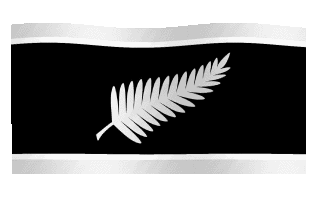
Variant 3: two white horizontal bars

Variant 4: two silver horizontal bars

Variant 5: a silver silver fern

After all, in its natural state it is a silver fern, not a white fern. (Even the white fern is still called silver.) 

White can make foreigners think ‘white feather’. But silver would be unique in the world of flags – a bold statement of a confident young nation.

I’ve had a shirt made with a silver silver fern on black, and it does look smart.

OK, do any of these options change your mind about a black flag?

Now a little about the heritage.

WHERE DO THE SILVER AND BLACK COME FROM?

Good question.

The silver fern is the native ponga. It was chosen as an emblem in its white form by Joe Warbrick, captain and organiser of  the New Zealand Natives (Maori plus five pakeha) rugby team of 1888.

Warbrick, now a subject of a short film, was inspired by two Maori proverbs: 

Mate atu he toa ara mai he toa.” 
“When one warrior dies, another arises.”

“Mate atu he tetakura ara mai he tetakura.”
“When one fern dies, another arises.”

Which does seem most apt for a game based on men supporting each other – not to mention an excellent  justification for a national emblem.

But why the black jersey?

The answer comes from All Black Tamati Ellison’s family, whose ancestor Tom was a star of  that Natives team.

More to the point, it was Tom Ellison’s idea in 1893 to make the  black jersey with silver fern the official New Zealand team uniform.

According to the Ellisons, Joe and Tom just thought black was the colour that would provide the best contrast with the white fern.

I can guess why Warbrick would have felt that way. You see, in 1884 he’d been in the first-ever New Zealand rugby team. 

And that team played in blue jerseys with a gold fern.

We know that, because last year the one below (right) was loaned to the New Zealand Rugby Museum by the family of the team’s first try-scorer.

But you’d never know looking at the official team photo that there was a gold fern on the jersey, would you? 

[575429D9-FBD7-A5C6-BD2DF5DBA5BA8FB7.jpg] 
The 1884 rugby team in blue jerseys and (invisible?) gold fern.

Were these players having their ferns drycleaned that day? Or did the dark gold simply not show up against the blue?

Could it be that Warbrick wanted a colour contrast that would let his emblem be seen in black and white photos, and so chose, um… black and white?

The photo of the 1888 team below suggests he succeeded – and a tradition was born.

The 1888 Native team, now in black jerseys with white fern.

In the 121 years since, the silver fern has been ‘our maple leaf’, representing New Zealand in sporting and non-sporting fields alike.

It would be a shame if the anti-sport brigade were to veto its use on a flag solely on the grounds that it started life on the Natives’ rugby jersey.

Because, of course, it didn’t.

It started life in the ground – as a native of the New Zealand bush.